|
<< Click to Display Table of Contents >> Text |
  
|
|
<< Click to Display Table of Contents >> Text |
  
|
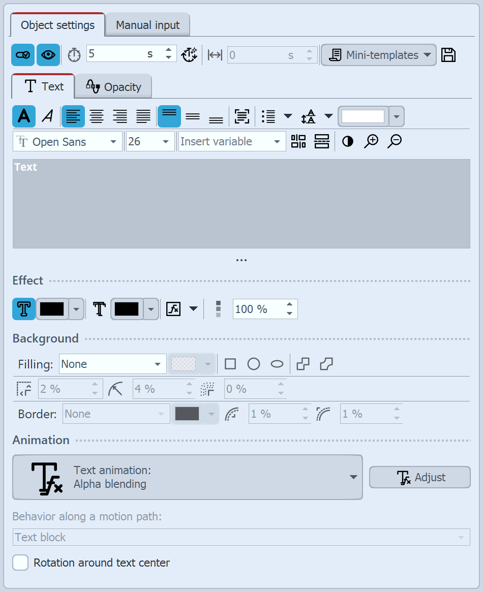
 Properties for Text object When you select a Text object, there are various setting options for the Text object in the Object settings window, which you will learn more about below. To influence the text properties, the text or text parts must be selected in the text field. In the font field and the font size field you set the font and letter size. Use the color selection field to influence the font color. The icons for Text bold and Text italic influence the font style. The text alignment as well as the position of the text in the text frame is determined by the following symbols:
VIDEO VISION STAGES The Insert variable field can be used to insert Exif and IPTC data into the text. The background color in the text field can be set to light or dark for better readability using the black and white button. You can use the magnifying glasses to enlarge or reduce the text field view to make it easier to read texts with very small or very large font sizes. In the Effect section, you can make settings for the text border, text shadow, opacity of the font color and text effects. These settings are applied to all text in the text field. |
The text can be displayed with a text background and/or with a text border. The following fields are activated by activating a selection under Filling or Border. The color for the text background and the border is defined via the color selector.
The text background and text border can be switched off again by setting the Filling to None.
|
Text filling as rectangular shape |
|
Text filling as circle shape |
|
Text filling as ellipse shape |
|
Simple connection |
|
Smoothed connection |
|
Margin between text and background |
|
Corner radius (only for rectangular shape background) |
|
Soft border |
|
Inner border |
|
Outer border |
If you want the text to be animated, you can select various predefined animations from the list. Via the button Tfx Edit effect you can adjust the animation individually. There you can also see a preview of the animations.
Under Behavior along a motion path you can define how the text behaves when you have assigned a motion path to it. You can choose whether the entire text block should be moved or whether the individual letters should run along the motion path. In this case, the letters "nestle" along the path.
If you want your text to run along a specific path, you can find instructions on how to do this in the "Motion paths with text" chapter.
Rotation around text center refers to animations in which the text is rotated. You can also specify a different rotation center under Adjust.
|
If red rectangles are displayed when selecting a font in the font list, this is an indication that the corresponding symbols cannot be displayed in this font and will be replaced by a standard font in the project. |
Changing the Opacity is described in the "Animated transparency" chapter.
|
How to save the font settings is described in the chapter "Program settings" in the item "Default image settings". |